Introduction
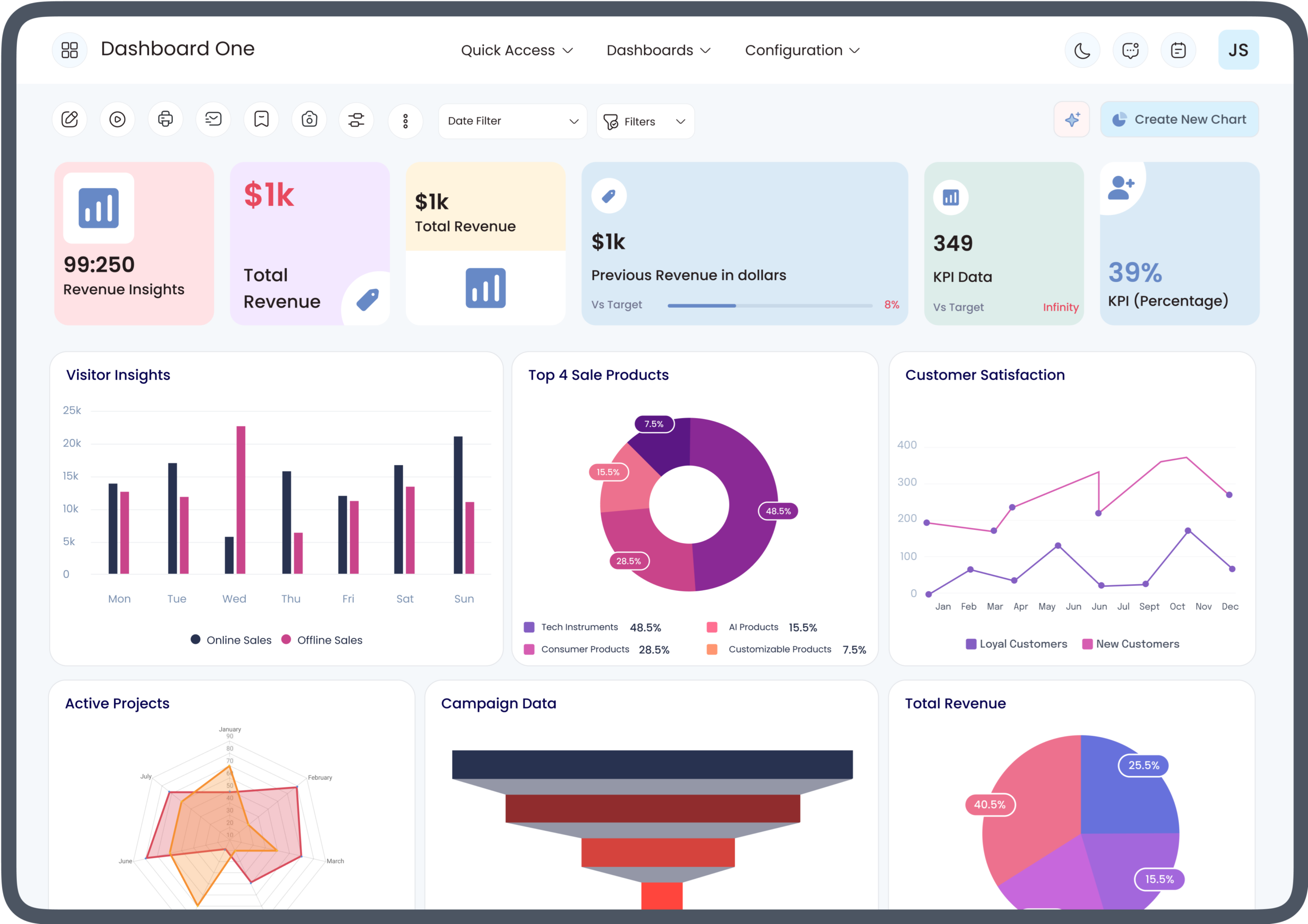
Modern businesses generate large amounts of operational data every day. The challenge is not simply collecting this information but turning it into useful insights that decision-makers can understand quickly. An Odoo App Dashboard can bring business information into one centralized view, while KPI Tiles make important performance indicators easier to identify and monitor.
When designed correctly, KPI Tiles help users focus on the metrics that matter most, such as sales, revenue, orders, inventory levels, receivables, or customer activity. Instead of searching through multiple reports, users can view key figures directly from the dashboard and investigate unusual changes when needed.
This article explains how KPI Tiles improve Odoo App Dashboard reporting, what information they can display, and how businesses can use them to build more practical and decision-focused dashboards.
What Are KPI Tiles?
KPI Tiles are compact dashboard components that display important business performance indicators in a simple visual format. A tile may show a single value, percentage, count, or other metric that helps users understand current performance.
For example, a KPI Tile could display:
- Total Sales
- Open Quotations
- Confirmed Orders
- Outstanding Invoices
- Inventory Quantity
- New Customers
- Purchase Orders
- Lead Count
- Gross Revenue
- Conversion Rate
The main purpose of KPI Tiles is to make important information visible without requiring users to open detailed reports for every metric.
What Is an Odoo App Dashboard?
An Odoo App Dashboard is a centralized interface that can bring data and reporting information from Odoo applications into a single workspace. Depending on the configuration, dashboards can provide information related to sales, accounting, inventory, CRM, purchasing, projects, and other business processes.
A well-structured dashboard can combine different reporting elements, including:
- KPI Tiles
- Graphs
- Charts
- Pivot reports
- Tables
- Filters
- Date ranges
- Drill-down information
This gives users a practical way to monitor business activity from one place.
How KPI Tiles Improve Odoo App Dashboard Reporting
1. Make Critical Metrics Easier to Find
One of the biggest advantages of KPI Tiles is that they place important metrics where users can see them immediately.
Without KPI Tiles, users may need to navigate through different Odoo applications or reports to find individual figures. A dashboard can reduce this friction by displaying priority metrics at the top of the reporting interface.
For example, a sales manager may want to monitor total revenue, quotations, confirmed orders, and sales pipeline activity. Displaying these metrics as KPI Tiles allows the manager to review the overall situation before examining detailed reports.
2. Simplify Complex Business Data
Business data can become difficult to interpret when presented only in detailed tables. KPI Tiles provide a simplified view by reducing large data sets into meaningful indicators.
Instead of reviewing hundreds of individual transactions, a user may first see a summarized value such as total sales or outstanding invoices.
This creates a two-level reporting structure:
KPI Tiles → Summary
Detailed Reports → Investigation
The summary helps users identify what deserves attention, while detailed reports provide the information needed to understand the underlying issue.
3. Support Faster Decision-Making
Decision-makers often need current information without spending excessive time searching through reports.
KPI Tiles support faster decisions by presenting essential information in a highly visible format. A business owner can quickly review financial or operational indicators and then determine whether further investigation is necessary.
For example, if a tile showing outstanding receivables increases noticeably, the finance team can examine customer balances and unpaid invoices in greater detail.
The tile itself does not replace analysis. Instead, it provides a starting point for analysis.
4. Improve Odoo Reporting Visibility
An Odoo App Dashboard can contain information from multiple areas of the business. However, a dashboard becomes more useful when users can immediately identify the most important numbers.
KPI Tiles improve reporting visibility by giving selected metrics a dedicated space.
This is especially useful when a business has numerous reports available but only a small number of indicators are needed for daily monitoring.
5. Create a Centralized Reporting Experience
Businesses frequently use multiple Odoo applications for different functions. Sales teams may work primarily in CRM and Sales, while finance teams use Accounting and management teams need information from several applications.
An Odoo App Dashboard can bring relevant indicators together.
KPI Tiles strengthen this centralized approach by presenting selected metrics in one interface. Instead of opening multiple screens, users can begin with a common dashboard and then move into individual reports as needed.
6. Make Performance Trends Easier to Monitor
A KPI becomes more useful when it can be interpreted in context.
Depending on the dashboard design and reporting configuration, KPI Tiles can be used alongside comparisons, targets, dates, or previous periods. This can help users determine whether performance is improving, declining, or remaining relatively stable.
For example, a sales dashboard may present current-period revenue alongside a previous-period comparison. The user can then investigate the underlying sales data when the movement requires attention.
The key principle is to provide context rather than simply displaying isolated numbers.
7. Improve Department-Level Monitoring
Different departments require different KPIs.
A sales dashboard may focus on:
- Revenue
- Orders
- Quotations
- Leads
- Conversion activity
An inventory dashboard may focus on:
- Stock levels
- Incoming shipments
- Outgoing shipments
- Reordering activity
An accounting dashboard may focus on:
- Receivables
- Payables
- Invoices
- Cash-related indicators
KPI Tiles allow an Odoo App Dashboard to be structured around the goals of each department rather than presenting every available metric at once.
KPI Tiles and Odoo App Dashboard Customization
The effectiveness of KPI Tiles depends heavily on dashboard design.
A customized Odoo App Dashboard can organize tiles according to business priorities, user roles, reporting requirements, and application data.
For example, executives may need a high-level overview, while an operations manager may require more detailed operational indicators.
Good dashboard customization considers:
- Which KPIs matter?
- Who will use the dashboard?
- How frequently are the metrics reviewed?
- What action should a user take when a KPI changes?
- Which detailed report should support the KPI?
This ensures that KPI Tiles are connected to actual business decisions rather than being included merely for visual appeal.
How to Choose the Right KPI Tiles
Adding too many KPI Tiles can reduce the usefulness of a dashboard. Users may find it harder to distinguish between critical indicators and secondary information.
A better approach is to select KPIs based on business objectives.
A useful KPI should be:
- Relevant to a specific business goal
- Clearly defined
- Based on reliable data
- Easy to interpret
- Actionable
- Appropriate for the intended user
For example, if a sales manager’s primary responsibility is revenue growth, revenue-related indicators should receive greater visibility than unrelated operational metrics.
Common Mistakes When Using KPI Tiles
Too Many Tiles
A dashboard filled with dozens of tiles can become difficult to scan. Users may spend more time looking at the dashboard than understanding it.
Unclear KPI Definitions
A KPI should have a clear meaning. Users need to understand what the number represents, which records are included, and what timeframe applies.
Using Vanity Metrics
Some figures may look impressive but provide little decision-making value. KPI Tiles should prioritize information that can influence business actions.
Lack of Context
An isolated number may not explain whether performance is good or bad. Comparisons, targets, trends, or supporting reports can provide necessary context.
Poor Data Quality
A dashboard can only be as reliable as the underlying data. Incorrect transactions, inconsistent records, or incomplete configurations can affect reporting accuracy.
Best Practices for Odoo App Dashboard Reporting
Keep the Dashboard User-Focused
Design each dashboard for a specific audience. Executive, finance, sales, inventory, and operations users may require different KPI Tiles.
Prioritize Actionable Metrics
Choose indicators that help users decide what to investigate or do next.
Use Consistent Definitions
KPI calculations should follow consistent business rules so users can trust the information across reports.
Connect Summary and Detail
KPI Tiles should work as an entry point to deeper reporting whenever more investigation is required.
Review KPIs Regularly
Business priorities change. A KPI that was important previously may become less relevant as processes, products, or goals evolve.
Avoid Unnecessary Complexity
A dashboard should make information easier to understand, not create another layer of complexity.
Role of KPI Tiles in Data-Driven Odoo Decision-Making
KPI Tiles can support a more data-driven approach to business management by making relevant information easier to access.
For example, management can use dashboard indicators to identify areas requiring attention, while department leaders can monitor the metrics connected to their responsibilities.
The value comes from the complete reporting process:
Business Data → KPI Calculation → KPI Tile → Detailed Analysis → Business Action
This structure helps organizations move from raw transactional data toward practical decision-making.
How KPI Tiles Support Different Odoo Applications
Sales
Sales teams can monitor order activity, quotations, revenue, and customer-related indicators.
CRM
CRM dashboards can highlight leads, opportunities, pipeline activity, and conversion-related metrics.
Accounting
Finance teams can use KPI Tiles to monitor invoices, receivables, payables, and other financial indicators.
Inventory
Inventory dashboards can display stock-related information, incoming and outgoing movements, and replenishment indicators.
Purchase
Purchasing teams can monitor purchase orders, supplier activity, and procurement-related metrics.
Project Management
Project dashboards can use KPI Tiles for task-related indicators, project activity, deadlines, and workload monitoring.
The exact KPI selection should depend on the organization’s processes and reporting objectives.
How to Improve KPI Tile Accuracy
Accurate KPI reporting begins with accurate source data.
Businesses should establish clear rules for:
- Data entry
- Record ownership
- Status definitions
- Date ranges
- Calculation methods
- Reporting filters
It is also important to validate KPI calculations against underlying records. When users understand where a metric comes from, they are more likely to trust the dashboard.
Future-Ready Odoo Dashboard Reporting
As businesses rely increasingly on real-time and centralized data, dashboard reporting will continue to play an important role in operational visibility.
An Odoo App Dashboard can serve as a foundation for structured business reporting, while KPI Tiles provide a quick-access layer for critical measurements.
The strongest dashboard strategy is not necessarily the one with the most visual elements. It is the one that connects trustworthy data with clearly defined business objectives and makes the right information available to the right users.
Conclusion
KPI Tiles can significantly improve an Odoo App Dashboard by making important business metrics easier to find, understand, and monitor. They simplify complex data, support faster analysis, improve reporting visibility, and help users focus on indicators that matter to their roles.
However, effective dashboard reporting depends on more than adding visual tiles. Businesses should select meaningful KPIs, maintain reliable underlying data, provide appropriate context, and connect summary metrics with detailed reports.
When these principles are applied together, an Odoo App Dashboard can become a practical reporting environment that supports informed and data-driven business decisions.
Frequently Asked Questions
What are KPI Tiles in Odoo?
KPI Tiles are dashboard elements that present important business metrics in a compact and easy-to-read format. They can be used to highlight selected performance indicators within an Odoo reporting environment.
How does an Odoo App Dashboard improve reporting?
An Odoo App Dashboard can centralize information from different business processes and present it through reporting elements such as KPI Tiles, charts, graphs, tables, and filters.
Why are KPI Tiles useful for business users?
KPI Tiles give users quick access to selected metrics without requiring them to search through detailed reports for every figure.
How many KPI Tiles should an Odoo dashboard have?
There is no universal number. The ideal number depends on the dashboard’s purpose, users, and reporting requirements. The focus should be on relevant and actionable KPIs rather than maximizing the number of tiles.
Can KPI Tiles be used for different Odoo departments?
Yes. Different dashboards can be designed around departmental requirements, including sales, CRM, accounting, inventory, purchasing, and project management.
