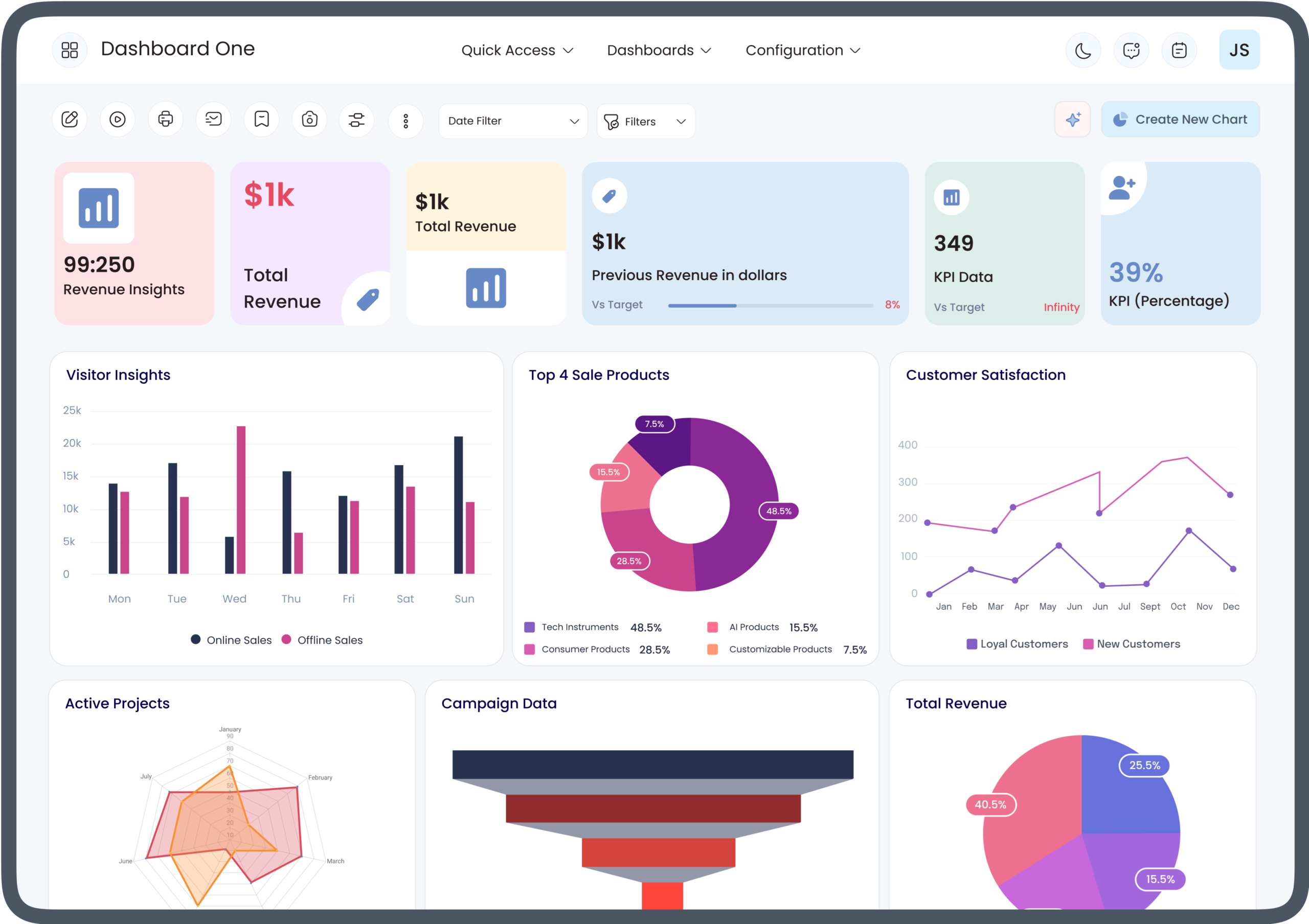
For businesses using Odoo, understanding data is just as important as collecting it. Sales, inventory, accounting, CRM, project management, and other business applications generate large amounts of information every day. An Odoo analytics dashboard helps turn this information into organized visual insights that users can review more easily.
For beginners, learning how Odoo dashboards work for beginners starts with understanding how business data is displayed through charts, graphs, lists, filters, and key performance indicators (KPIs). Instead of reviewing individual records one by one, users can use dashboards to identify trends, monitor performance, and support everyday business decisions.
This guide explains Odoo dashboards from a beginner’s perspective, including their purpose, components, benefits, setup considerations, and practical ways to use analytics effectively.
What Is an Odoo Analytics Dashboard?
An Odoo analytics dashboard is a visual interface that presents business information in an organized format. Depending on the Odoo application and configuration, dashboards can display information through graphs, pivot views, lists, KPIs, and other reporting elements.
For example, a sales dashboard may help users review sales orders, revenue-related information, products, customers, or sales activities. An inventory-focused dashboard may provide insight into stock movements and product availability.
The primary purpose is to make business information easier to interpret without requiring users to manually analyze every individual record.
How Odoo Dashboards Work for Beginners
Understanding how Odoo dashboards work for beginners becomes easier when the dashboard is viewed as a connection between business records and visual reports.
Odoo applications store operational data such as customers, invoices, sales orders, products, employees, and projects. Reporting tools can organize that data into views that allow users to analyze specific dimensions.
A beginner typically interacts with a dashboard by:
- Opening the relevant Odoo application.
- Selecting a reporting or dashboard view.
- Reviewing available metrics or visualizations.
- Applying filters to narrow the information.
- Grouping data according to useful categories.
- Exploring individual records when more detail is needed.
- Using the resulting information to monitor business activity.
The exact dashboard experience depends on the Odoo version, installed applications, configuration, user permissions, and any additional customization.
Key Components of an Odoo Analytics Dashboard
An Odoo dashboard can contain several components that make business data easier to understand.
KPIs
Key performance indicators provide a quick view of important business measurements. A KPI may represent information such as sales activity, outstanding invoices, orders, or other metrics relevant to a particular business process.
KPIs are particularly useful when managers need a quick overview before exploring detailed reports.
Charts and Graphs
Charts transform numerical information into visual patterns. Depending on the report, users may encounter bar charts, line charts, pie charts, or other visualization formats.
Charts can help users identify changes over time, differences between categories, and areas that require additional investigation.
Pivot Reports
Pivot views allow users to analyze information across different dimensions. For example, sales data may be grouped by salesperson, product, customer, or time period.
This makes pivot reporting useful when a business wants to examine the same data from multiple perspectives.
Lists and Detailed Records
Visual dashboards provide an overview, but users often need access to the underlying records. List views can provide additional details that explain the numbers shown in a report.
This connection between summarized information and individual records is important for effective business analysis.
Filters
Filters allow users to limit the data displayed in a report. A user might filter information by date, salesperson, customer, product, company, or another available field.
Filtering helps beginners avoid analyzing irrelevant information and focus on a specific business question.
Grouping Options
Grouping organizes records into categories. For example, a user could group sales information by salesperson or customer.
Combining filters and grouping can make large datasets easier to interpret.
Why Businesses Use Odoo Analytics Dashboards
Businesses often need timely information to monitor operations. Reviewing raw records individually can make this process more difficult as data volume increases.
An Odoo analytics dashboard can provide a centralized view of selected business information. Instead of moving between multiple records, users can start with a summarized report and then investigate specific areas.
Common benefits include:
- Faster access to business information
- Easier identification of trends
- More organized reporting
- Better visibility into operational activity
- Simplified monitoring of KPIs
- Easier exploration of business data
- Improved access to real-time or updated information, depending on configuration
The value of a dashboard ultimately depends on the quality of the underlying data and how appropriately the reports are configured.
How Beginners Can Navigate an Odoo Dashboard
Beginners should start with the most important business questions rather than trying to understand every available report at once.
For example, a sales manager may want to know:
- How many orders were generated?
- Which products are selling?
- Which salespeople are active?
- How has sales activity changed over a selected period?
The user can then select the appropriate report and apply relevant filters.
A good beginner workflow is to start broad, filter the data, identify a pattern, and then investigate the underlying records.
This approach makes dashboards more useful without overwhelming new users with unnecessary information.
Odoo Dashboard Filters and Date Ranges
Date filters are especially important when working with analytics. A report covering an entire year can tell a different story from one covering the current month.
Users may want to examine information by:
- Today
- This week
- This month
- Previous periods
- Custom date ranges
The available options depend on the report and configuration. Beginners should always check the selected date range before interpreting dashboard results.
For example, a sudden decrease in sales may appear significant until the user realizes that the dashboard is comparing different periods or using a narrower date range.
Using Odoo Analytics for Sales Reporting
Sales is one of the areas where dashboard-based analysis can be particularly useful.
A sales analytics dashboard can help users examine information such as orders, products, customers, salespeople, and time-based activity, depending on the configured reports.
A manager could begin with an overall sales report and then apply filters to examine a particular salesperson, product category, or period.
This layered approach allows users to move from a high-level overview toward more specific analysis.
Using Odoo Dashboards for Inventory Analysis
Inventory data can become difficult to monitor when businesses manage many products and transactions.
Dashboard-based reporting can help users analyze inventory-related information through available reporting views. Depending on configuration, users may investigate product movements, quantities, warehouse activity, or other inventory information.
For beginners, the key is to understand what each metric represents before using it for operational decisions.
Using Odoo Dashboards for Accounting and Finance
Financial information requires careful interpretation because different reports can represent different accounting concepts.
Odoo reporting capabilities can help users access financial information through relevant accounting reports and analytical views. Users should understand the purpose and data source of a report before drawing conclusions from it.
For example, an invoice-related report should not automatically be interpreted as the same thing as a profitability or cash-flow analysis.
How to Build an Effective Odoo Analytics Dashboard
Creating an effective dashboard starts with identifying the business objective.
Instead of adding every available metric, businesses should determine which information users actually need.
A practical process includes:
1. Define the Business Goal
Determine what the dashboard should help users understand. The goal could involve sales monitoring, inventory visibility, project tracking, accounting analysis, or another operational requirement.
2. Select Relevant Metrics
Choose KPIs and reports that directly support the goal. Too many metrics can make a dashboard difficult to interpret.
3. Organize the Information
Place related information together so users can move logically from summary metrics to detailed reports.
4. Add Useful Filters
Filters should help users answer common business questions without requiring unnecessary manual data manipulation.
5. Test the Dashboard
Verify that the displayed information matches the underlying records and that users can understand what each metric represents.
Common Mistakes Beginners Make With Odoo Dashboards
Learning how Odoo dashboards work for beginners also means understanding what to avoid.
Using Too Many Metrics
A dashboard filled with charts and KPIs may look comprehensive but can make important information harder to identify.
Ignoring Filters
Users can reach incorrect conclusions if they do not check the selected date, company, product, or other filters.
Confusing Different Metrics
Two reports may use related information but represent different measurements. Users should understand the definition of each metric.
Relying on Incomplete Data
A dashboard is only as reliable as the information feeding the report. Missing, outdated, or incorrectly entered records can affect the usefulness of analytics.
Failing to Review Underlying Records
A dashboard can identify an unusual trend, but users may need to investigate the underlying records to understand why it occurred.
Odoo Dashboards and Business Intelligence
Odoo dashboards can contribute to a broader business intelligence strategy by making operational data more accessible.
Business intelligence involves collecting, organizing, analyzing, and interpreting information to support business decisions. An Odoo dashboard can serve as one layer of this process by presenting information in a visual format.
However, a dashboard should not be treated as a replacement for analysis. Users still need to understand the business context behind the numbers.
How to Improve Odoo Dashboard Performance
Businesses can improve dashboard usefulness by keeping reports focused and ensuring the underlying data is properly maintained.
Useful practices include:
- Remove unnecessary dashboard elements.
- Use meaningful KPI definitions.
- Keep filters relevant to user requirements.
- Review data quality regularly.
- Avoid duplicating the same information across multiple reports.
- Give users appropriate access permissions.
- Review dashboards periodically as business requirements change.
For larger datasets or complex reporting requirements, technical configuration and performance optimization may also be necessary.
Odoo Dashboard Customization
Standard reporting options may be sufficient for many users, but some businesses require customized dashboards.
Customization can involve additional fields, specialized KPIs, custom reports, dashboard layouts, or integrations with other systems.
The appropriate approach depends on the organization’s reporting requirements, Odoo version, installed applications, technical environment, and user roles.
Customization should have a clear business purpose rather than simply adding more visual elements.
Odoo Analytics Dashboard Best Practices
For an effective analytics environment, businesses should focus on clarity, relevance, and consistency.
A useful Odoo analytics dashboard should:
- Focus on a specific business purpose.
- Display meaningful KPIs.
- Use understandable visualizations.
- Provide useful filtering options.
- Connect summary information with detailed records.
- Use accurate and maintained data.
- Be reviewed regularly.
- Match the needs of its intended users.
These principles can help beginners and experienced users get more value from Odoo reporting.
Final Thoughts
Understanding how Odoo dashboards work for beginners starts with a simple concept: dashboards organize business information into visual reports that make important data easier to review.
An Odoo analytics dashboard can bring together KPIs, charts, pivot reports, filters, groups, and detailed records to help users explore business performance. Whether the focus is sales, inventory, accounting, CRM, or project management, the most effective dashboards are built around clear business questions.
For beginners, the best approach is to start with a small number of meaningful metrics, learn how filters and grouping affect reports, and gradually explore more advanced analytics features. With accurate data and thoughtful configuration, Odoo dashboards can become an important part of a structured business reporting and analytics workflow.
